Over 6 months at the Apple Developer Academy | IFCE UX residency, we led UX/UI Design for IT Guys — Lientech’s tech recruitment and consulting platform. The challenge was twofold: position the company as a strategic partner, not a generic vendor, and translate that into a digital experience that worked for both candidates and hiring companies.
The outcome was a full ecosystem: iOS app, institutional website, and a design system with reusable components, palette, and Poppins typography. Below is the process from market diagnosis to MVP.
Understanding the context
Lientech operates in tech recruitment and consulting. IT Guys was built to communicate expertise clearly: service blocks, candidate journey, and a tech visual language — clean, dark where it makes sense, always readable.
Before opening Figma, we aligned scope and deliverables: market research, app and site UI, component system, and styleguide. Interface decisions needed to be grounded in real data on how candidates use — and get frustrated with — job platforms.
Benchmarking: what the market already does
We mapped 5 recruitment companies to understand product patterns, visual tone, and mobile presence. The split was clear:
With their own app: Indeed, Taqe, and Catho — investment in mobile experience and notifications.
Web only: Gupy and Solides — robust desktop flows, but no dedicated native app.
We analyzed application screens, filters, dashboards, and onboarding for each competitor. Gupy and Solides showed mature desktop interfaces; Catho and Indeed reinforced the importance of quick applications and status tracking on mobile. That landscape showed where IT Guys could differentiate.
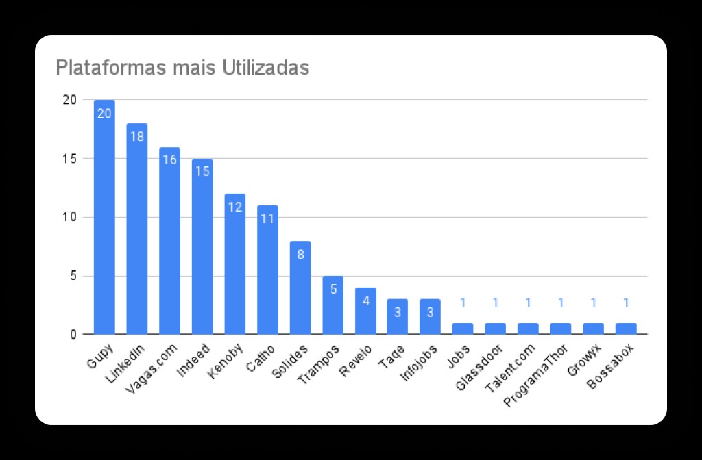
Quantitative research with candidates
We ran an anonymous survey to measure satisfaction and behavior on recruitment platforms. With 20 responses, three numbers stood out:
45% did not get a job through the platforms they use.
30% rated satisfaction 1/5 — very dissatisfied.
95% did not receive adequate feedback on a hiring process.
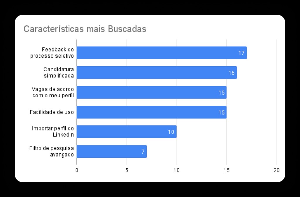
Gupy was the most-used platform (100% of respondents), followed by LinkedIn and Vagas.com. Among the most requested features, candidates asked for transparent feedback on hiring processes and simplified applications, LinkedIn-style — few taps, résumé already known.
Interviews: the qualitative layer
Numbers pointed direction, but context was missing. We interviewed 6 Academy students to deepen real experiences with job platforms. Insights repeated with variations:
Difficulty filling out and keeping résumés up to date
Challenge interpreting job requirements
Lack of response and feedback after applying
Desire for more objective tests and clear instructions
Frustration with long processes and too many questions
Valuing personality and soft skills, not just hard skills
These findings became design principles: reduce application friction, make requirements scannable, signal process status, and leave room for human communication — including via virtual assistant.
Visual identity and design system
With research in hand, we moved to identity. The palette combines forest green (#1D3400) and lime (#7BD900) with charcoal and gray neutrals — high contrast for small screens without losing tech personality.
Poppins typography (weight 600 on highlights) ensures readability in titles and CTAs. We documented colors, type, and components in the styleguide so app, site, and future screens shared the same foundation.

From site to app: the iOS MVP
The first mobile version needed to cover essentials: login, job interaction, and integration with Asla — Lientech’s chatbot that guides candidates and answers questions about processes.
To move fast, we reused components from the web version and adapted them to iOS interface guidelines. Listing screens, job detail, and application flow followed patterns familiar to Apple users while keeping Lientech identity.
Website and institutional journey
In parallel with the app, we designed the institutional site: hero with value proposition, service blocks, metrics, and differentiators. The narrative reinforces tech partner positioning — not just a job board, but consulting with method.
Expertise cards, number sections, and clear CTAs connect visitors to action: explore services, talk to Lientech, or download the app. Responsive layout keeps hierarchy and breathing room on desktop and mobile.
What we delivered
IT Guys shows how 6 months of UX/UI with method — benchmark, quant, qual, design system, and MVP — turns a tech recruitment brief into tangible product. Research didn’t stay on slides: it became simplified applications, feedback as a feature, and Asla as a bridge between candidate and company.
To see screens, styleguide, and full deliverables, check the IT Guys case study in our portfolio. If you’re building a job platform, HR tech, or dual-journey B2B product, the process we used here is a solid starting point.