In 2025, Íntegra Estratégias needed a brand that matched the scale it had already reached: present in 16 states, with 70+ projects and R$ 5B+ in projected investments. The consultancy structured high-impact businesses for public and private organizations — but the identity still felt operational, distant, and tied to a name that no longer reflected its positioning.
The challenge was clear: less operational, more strategic; less distant, more human. We developed the complete rebranding — brand strategy, visual identity, manual, stationery and swag applications, OOH media, and the site at integraestrategias.com.br.
Why rebranding, and why now
Íntegra was born from expertise in PPPs and structuring complex businesses. As it grew, it needed to communicate breadth: systemic thinking, long-term vision, and commitment to real impact — not just technical delivery.
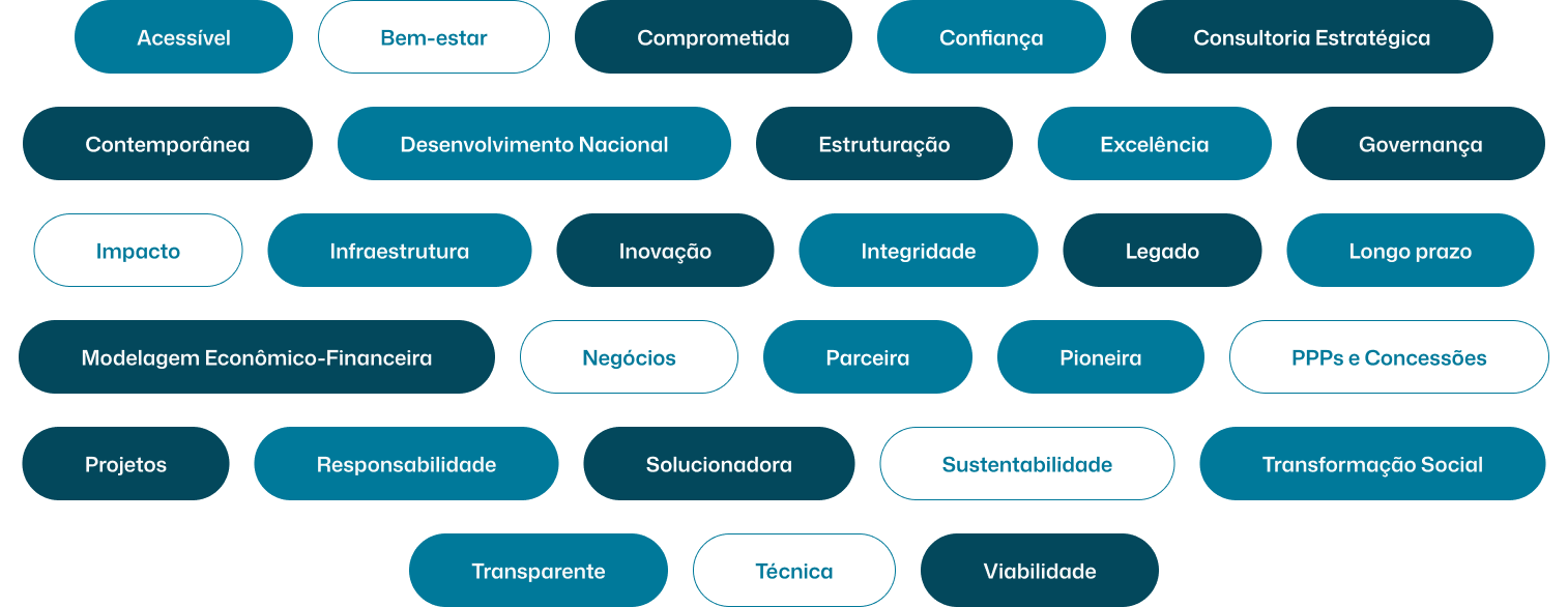
Purpose guided everything: turn complexity into clarity and technical projects into real impact on people's lives, with excellence, integrity, and long-term vision. That north star became the Golden Circle, positioning keywords, and the foundation for name, slogan, and visual identity.

Íntegra Estratégias: name, slogan, and narrative
We consolidated the name Íntegra Estratégias, replacing Íntegra Estruturações e Estratégias. Íntegra carries the company's core value — integrity — and derives from Latin integer, "whole, complete, intact". It communicates an integrated view of projects, transparency, and genuine commitment.
Estratégias positions the consultancy beyond operational work: breadth, systemic thinking, and long-term vision. Together, the name expresses structuring complex businesses with excellence and integrity.
The slogan "Estruturando negócios, transformando vidas." connects technical expertise and human impact. Estruturando negócios speaks to what the company does; transformando vidas elevates the message from technical to social. It balances rationality and purpose.
Visual identity: from moodboard to symbol
The identity needed to be institutional without feeling cold: trust for public and private sectors, modernity for a leading consultancy, readability in technical documents, and strong presence at events and outdoor media.
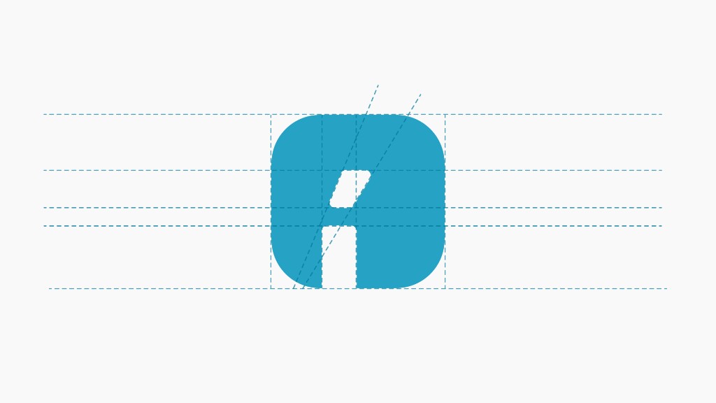
We started from a moodboard balancing deep blues, light neutrals, and precise geometry. The symbol comes from a geometric construction — modular grid suggesting structure, layers, and integration — and lettering was designed to work with the icon in horizontal, vertical, and standalone versions.

Styleguide: Mona Sans and institutional palette
We documented palette and typography in the styleguide. The Mona Sans family brings contemporary neutrality to long texts, titles, and interfaces. Colors anchor the brand:
Blue (#007BA2) and Dark Blue (#003F54) — trust and institutional depth
Black (#0D1F23) — contrast and seriousness in documents and presentations
Gray (#BFC7C9) and White — breathing room, hierarchy, and readability
The manual guides correct symbol use, clear space, color combinations, and applications on light and dark backgrounds — essential for a consultancy moving between governments, investors, and large-scale events.
Applications: from business card to billboard
Rebranding doesn't end at the logo. We developed stationery (cards, letterheads, envelopes), swag (mugs, pens, notebooks, stickers), uniforms (institutional polos), signage (office wall, event booth), and OOH media (billboard, airport).
We also adapted the identity for social media — Instagram profile and posts, LinkedIn cover — and app icon, ensuring recognition at every touchpoint.
Institutional site: integraestrategias.com.br
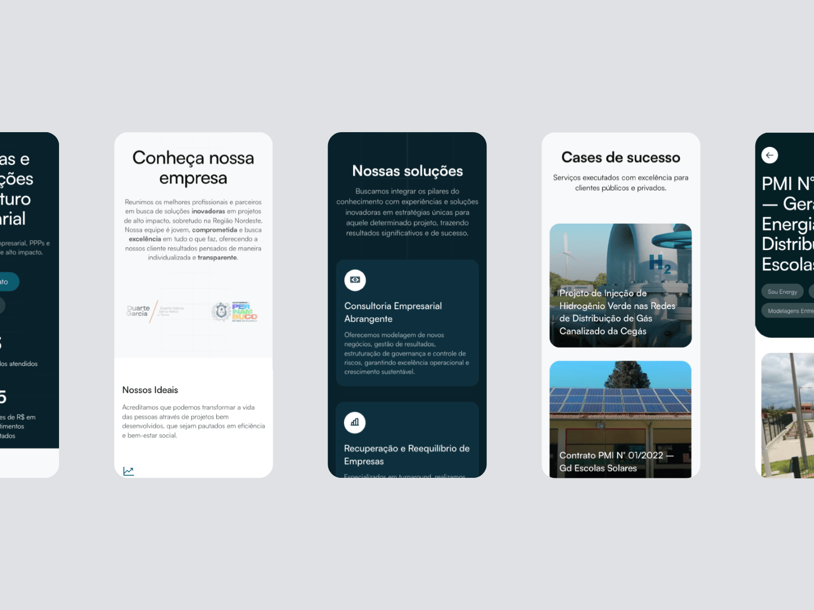
The new brand needed a digital home to match. We built the institutional site with home, services, portfolio, about, blog, and contact — architecture designed to convert visitors into qualified conversations and reinforce technical credibility.
The layout translates the identity: Mona Sans typography, institutional blues, metric blocks (70+ projects, R$ 5B+, 16 states), and clear CTAs. The mobile version keeps navigation and hierarchy on small screens — essential for decision-makers consuming content on the go.
What changed
The Íntegra Estratégias redesign wasn't just visual. It was repositioning: a clearer name, human narrative, consistent identity, and digital presence that reflects the consultancy's real scale. From PPPs and financial modeling to governance and social development — everything is now communicated with the same integrity the name promises.
To see the styleguide, mockups, site screens, and full deliverables, check the Íntegra Estratégias case study in our portfolio. If your consultancy, B2B company, or institutional organization needs to move from an operational look to strategic positioning, this process is a reference.