
Utilities software brand and site in 1 month
View project (opens in a new tab)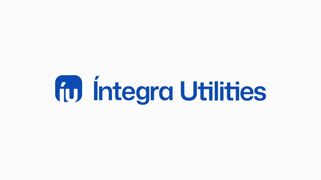
The brand needed to match the software, without starting over.
Íntegra Utilities already sold software for urban utilities (water, energy, gas, and sanitation). The visual brand did not keep up with the product. The brief was evolution, not a full rebrand.
In 1 month we updated the iu logo and symbol, a styleguide with palette and Mona Sans, digital applications, and the site at integrautilities.com.br.
What changed
The brand existed, but it did not support B2B utilities software with the same clarity as the product.
1 month
From brief to a live site
5
Logo variations ready to use
Live
integrautilities.com.br
A brand update, not a full rebrand. Continuation of the partnership with the Íntegra group.
How we worked
Alignment
The request was a brand update, not a full rebrand.
Production
iu logo, styleguide, applications, and site, reviewed in stages over 1 month.
Delivery
Site live. Continuation of the partnership with the Íntegra group.
Íntegra Utilities
Íntegra carries the company's core value: integrity. It derives from the Latin *integer*, "whole, complete, intact", and communicates an integrated view of operations, with transparency and a commitment to results.
Utilities positions the company in urban infrastructure: water, energy, gas, sanitation, and smart city. Together, Íntegra Utilities expresses specialist software for operations that cannot stop.
Styleguide
Colors
Typography
Mona Sans
ABCDEFGHIJKLMNOPQRSTUVWXYZ abcdefghijklmnopqrstuvwxyz 1234567890 !@#$%^&*()-=+~<>?
Moodboard
Grid
Lettering
Logo variations
Media applications
Deliverables
- Brand update, logo, and iu symbol
- Styleguide: color palette and Mona Sans typography
- Digital applications: website, app icon, and patterns
- Institutional website
Institutional website
Site published at integrautilities.com.br, home, about, and contact.
Mobile version
Responsive layout on key pages, navigation and content adapted for smartphone.
Frequently asked questions about this case
Straight answers before we start the conversation.
Belin Design updated the Íntegra Utilities brand: iu logo and symbol, styleguide with palette and Mona Sans, digital applications (website, app icon, and patterns), and the institutional site at integrautilities.com.br.
No. It was a brand update, not a full rebrand: evolution of the symbol, logo variations, and site, without rebuilding positioning from scratch.
The project lasted 1 month. The delivery was published in August 2026.
Íntegra Utilities builds software for urban utilities: water, energy, gas, sanitation, and smart city, with more than 18 years of specialization.
The institutional site is live at https://integrautilities.com.br, with home, about, and contact pages.
More projects
Next step
Want a partner at this level for your business?
Tell us where you are and what you need. Within 24h we reply with suggested scope or a call invite.